Showing posts with label fashion. Show all posts

Tuesday, 24 February 2015

ASOS Project

We recently had a very exciting project at college where we partnered with ASOS to produce a skirt suited for their customers. My chosen decade of research was the 90s and within that decade I decided upon using the theme of technology.

I enjoyed the illustration aspect of this project, I adapted my illustration style slightly to mimic Microsoft Word Clip Art, in order to enforce my 90s technology theme. I liked doing something slightly different with my illustrations: Adding bold lines and partially colouring the illustrations was quite refreshing compared to how I usually decide to illustrate. Unfortunately I don't have many images of these illustrations as I've been having issues with my computer, but here are some I managed to find on my Ipod. I'd also like to add, out of all the projects I've done at college so far, these are by far my most favourite design boards. They're a bit more simple than what I usually go for, which I like a lot.

What I'm most ultimately pleased with in this project is my photoshoot, I didn't focus as much on the styling here as I ought to have but I think the location I chose for it was perfect. I'm also really pleased that I managed to find a top that matched my skirt perfectly, the main issue I have with the styling for this shoot is that I couldn't find any decent shoes for the model as she's such a small shoe size, so she ended up just wearing her own that didn't go too well with the skirt! Here's some of the best photos from the shoot: 


Here's my skirt, to say I don't enjoy sewing I'm pleased with how this came out, I'm really glad I added the grid print (which I printed onto the fabric myself by the way) as I think it really strengthens the technology theme. If I'm honest, I kind of wish I hadn't added the applique details as I think they make the skirt look a little too busy, but maybe I'm just saying that because they were such a hassle to put on! I've definately learnt a lot during this project and it's made me feel very eager and ready to make a start on my FMP, bring it on!

Thursday, 18 December 2014

M.A.C Cosmetics Marketing Project: Done and Dusted!

This is quite a delayed post as our M.A.C project ended quite a few weeks ago, but I just got my results back for the project today (which were very positive, yay!) so I thought I'd share with you what the whole thing was like and how it turned out!

First off I'll tell you what the project brief was and what we actually ended up doing, before I get too ahead of myself aha. Our brief was to design and market two promotional t-shirts, in groups of four, for a M.A.C lipstick collection of our choice. As a group we decided to fuse two of our favorite lipstick collections together, Punk Couture and A Tartan Tale, which we appropriately named Tartan Punk. I'll not bore you with hundreds of details, but by the end of it all, we'd created two T-shirts, a promotional scarf, staff uniform, illustrations and spec drawings, a styled photo shoot, a press release, a marketing report and packaging. As it was group work however all these tasks we're split between us, and I ended up with the task of illustrations and specs, the press release and part of the photography for styled photo shoot as me and another group member decided to share this task.

Not the best photo, but here's all our work together!
The part I enjoyed most was definitely the photoshoot, I'm really pleased with how the images came out, here's some of my favorites:

we didn't actually use this one in the lookbook as we thought the people from m.a.c might not like the fact our male model is smoking as it may reflect badly on m.a.c's image, but i think the smoke came out really well on the photo so i like it a lot!


This is the first assignment we've done at college that has really stood out to me as something a bit different and as a huge learning curve. For starters it was a group assignment, the first one we've done actually, which made me a little apprehensive as I was unsure if it would go well or how I'd react to criticisms of my work from the rest of my team. Luckily it went like a charm and we all worked together really well (phew!). The second thing that really really made this project stand out to me was the fact that we'd actually be presenting our finished work to people from M.A.C Cosmetics. It was quite daunting to say the least, and I'm an awful public speaker! Thankfully though that went pretty smoothly too (more thanks to my other team members really) and the feedback we got of our finished work and presentation of it was really positive! Overall I really enjoyed this project and I think I learnt a lot from it, I'm looking forward to doing similar things in the future!

Saturday, 14 June 2014

Collar to Cuff Project: Fashion Illustration Boards

Here's a quick look at my fashion illustration boards from this latest project. I took inspiration from Jamie Reardin for my illustration style and although I think these are loads better than the illustrations I produced for my other project, I still think I need to majorly work on my drawing skills. Sorry the pictures are a bit rubbish by the way, I took them on my phone whilst in class so I was kind of rushing.
i think this is probably my least favorite design board...
and this is my favourite! Really proud of how these ones turned out.
Bit blurry agh! Sorry!
I really like this one too! Mostly because of the colours.

Friday, 13 June 2014

Collar to Cuff Project: More Bag Development and Finished Bag!


 Here are some photos of my marketing bag, finally completed! My bag is based solely around one image I found of a moth, I chose this image as I found the colours and patterns of the moth really fun, and I thought there was a lot I could play around with. I'm so so pleased with the final result! Creating my bag was definitely the part of this project I enjoyed the most, not just because I like the outcome, but because I had so much fun dyeing the fabrics and painting the pattern! Speaking of the pattern on my bag- I did have a bit of trouble with that at first. Originally I planned to applique the triangles on, but I'm really glad I went for using fabric paints as I think it looks a lot neater. Also, to help my bag link in with my shirt design even more, I decided to wad the wing element of my bag too, just like the wing elements on my shirt are wadded. I think this adds a really nice connected vibe between my bag and shirt. I really hope in future projects we get to do something similar to this, as I really loved the entire process!


Thursday, 5 June 2014

Collar To Cuff Project: Finished Shirt!


It took me awhile, but I've finally finished my shirt for my latest college project! This is the first time I've made something that I've designed, and I'm quite pleased with the final outcome. There's definitely areas I need to improve on with my sewing as I really struggled with some parts of my garment, and I think that really shows when you take a close look at the construction of my shirt. Despite me not wanting to progress onto a designing and making course if I go to university, I still hope I can improve my sewing for my next project!

For the brief of this project we were asked to use only black and white cotton, and to pick a theme to base our shirt designs on. I chose insects for my theme and I think that really translates well when you look at my shirt. Apart from the obvious wings on the back of my shirt, the peplum and the cuffs are also meant to represent insect wings. I filled them with wadding to make them standout more, which I think gives these areas a really nice look to them. The only thing I would have done differently is add a print to the peplum area, similar to the patterns seen on insect wings, so that the shape on the peplum really did look like wings. I think this would have made my shirt much more interesting and I think it's a shame that I didn't end up adding a print. 

Despite everything though I'm really happy with the outcome of my shirt. To say it was my first time ever making something I'd designed, and that at first I found the idea very daunting, I think I gave it my best.


Saturday, 10 May 2014

Fashion Marketing - Promotional Materials - Bag Making Progress


Recently I've started on making my promotional bag for my fashion marketing course, I've cut out the pattern pieces of my tote bag and have begun to dye them. Here are pictures of the body parts and strap parts of my bag, I've used a light layer of cracked wax on them and then dyed over that, so the dye will seep into the cracks and only dye parts of the fabric. The pieces look a little weird at the minute because they still have wax on them, but I'm hoping that once I've finished messing about with them that they'll look okay!

I'm also thinking about smearing some powder paint on these pieces too as it leaves a good effect on the fabric, but I'm not sure yet. Either way I need to get this bag finished pronto!


Thursday, 24 April 2014

Finished Shirt Toile - First Ever Design Turned Into An Actual Garment!


Well, when I say finished, another back piece needs to be added to the other side... But still... I can count this as finished right?
For a while in our pattern cutting class now we've been working on making pattern pieces, and then cutting them out in calico and constructing our toiles. I'm quite slow at doing all this, I do everything slowly (it irritates me sometimes) so I'm a little behind everyone else in the class. Today though I finally managed to reach a point where I'm more or less up to date with the rest of the class. 

I found making my toile very difficult, sewing isn't my strong point, and it didn't help that I was very unclear in my mind as to how I would actually make what I'd designed. Luckily I didn't have to work it out completely on my own, and I was guided by the teachers on the best methods to use to create my shirt. I think there's a lot I need to improve on, I definitely want my final shirt to look a lot better and more well constructed. The shape of the peplum and cuffs are what I feel needs the most improvement, as they one of the main focus points of the garment and I've managed to make them look a little misshaped. A lot of the end parts of the peplum are more pointed when I want them to be curved, same goes for the cuffs. I'm hoping this is something I can easily rectify when it comes to putting together my final version. What I like most about my toile are the wings on the back. I think they're really well done and have the perfect curved shape at the end, just how I wanted. I also really like how they wrap round the shoulder slightly, I think that's a nice touch and is just how I pictured it whilst I was working on my illustrations. I also really like (and am surprised by) how good the wings look from the back. I hope I can make them as good as this, if not better, on my final piece.

Now all I have to do is draw out my best patterns, decide which pieces I want in black fabric and which in white, do my lay plan, complete my whole technical file and make the final shirt (and I still have work in my fashion illustration and marketing lessons to finish). Yeah... I have a feeling I'm going to be very busy in the upcoming weeks!

Tuesday, 8 April 2014

Experimenting With Decorative Techniques - Dyes


At college, in preparation for making our bags for the fashion marketing side of our project, we've been experimenting with different decorative techniques. We've also done some experimentation with applique and batik, but using the dyes is what I found the most fun, so I thought I'd share my tester pieces with you.

Equipment used: Dye, hot wax, brusho powder.

This piece of experimentation is the one I am most pleased with the outcome of. I really like the colours used, but most of all I love the texture the brusho powder adds to it. I created this by smothering the calico with a thin layer of hot wax, leaving it to dry, and then cracking the dried wax. I then got a paint brush and began to dab fabric dye over the wax-covered calico, trying to get the dye into the cracks of the wax and onto the fabric. After doing this I washed off the wax. Whilst the calico was still wet, I smeared the brusho powder onto it. The brusho got a bit clumped up in some places, but overall I think it created a nice effect.

Equipment used: Lolly-pop sticks, rubber bands and dye.
This was meant to be a tie-dye effect, but as you can see it went a little wrong. At first I folded my fabric tightly around a lolly-pop stick, then snapped the stick in half and then added rubber bands around the calico and sticks. Unfortunately the rubber bands and stick barely effected the fabric at all because I'd done it too tight, so instead I just dipped the calico in blue and purple dyes to create an dip dye or ombre effect.

Equipment used: Rubber bands, marbles, lolly-pop sticks and dye.
I don't know what I was trying to achieve with this one, just messing around with all the different effects you can make really. I wrapped the fabric around the marbles and secured it tightly with an elastic band, this caused the dye to be unable to reach all parts of the fabric, which caused the orange circles to be created. I think it looks quite funky.

Equipment used: Wax and dye.
I wanted to re-create the first one I did with brusho and wax here, but this time I used too much wax and it caused the dye to be unable to seep through. I also made the mistake of putting the wax on wet fabric. It's left a very subtle looking effect on the fabric, which I suppose is okay but it isn't what I was after. It's a learning process!

Equipment used: Wax and dye.
I did the same again but wanted it to look more pastel this time. I used blue and purple dye and I quite like this one, I like how the purple is barely noticeable. I think these colours compliment each other well when used like this.

Equipment used: Wax, Dye and brusho
I like this one quite a bit, the brusho powder is more blended in and gives a less obvious textured effect to the fabric which I think looks very good. I also like how natural the colours look.

thanks for reading this post! I know a lot of these aren't very good, but they're only experiment pieces so I was just playing around with different ways I could do things so I wasn't really thinking about aesthetics all that much. I hope that if I choose to use any of these techniques in my actual work that they turn out more consistently better, that probably won't happen knowing me though!

Monday, 31 March 2014

Collar to Cuff Project- Research

At college we are currently working on a new piece of coursework, where we have to design a shirt on our chosen theme using only black and white cotton. For my theme I have decided to do insects. I chose insects not only because I find them fascinating, but because there's just so many different types of insects, giving me countless aspects which I could take my inspiration from. Here's some photos from my sketch book in the researching progress, not all pages are finished or annotated yet but I'm getting there :)

Here I'm focusing mostly on moths and butterflies and the patterns that can be seen on their wings.

Close up of my first drawing in my new projects sketch book. I really like how the colour of the wings turned out.

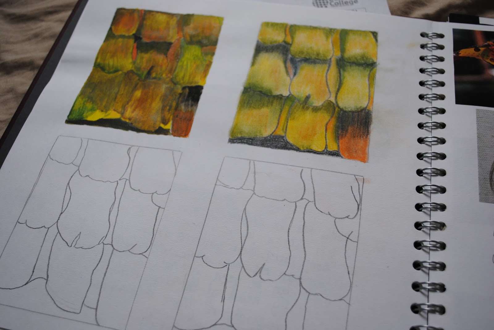
Here I'm drawing an extreme close up of butterflies wings using different types of media to see which I work with best, and which gives me the best results. At the moment this is unfinished.

More research on moths, this time focusing more on their shapes and how I could translate that into a shirt design.

Here I extended my research to beetles, focusing slightly on their pincers.

First design, inspired heavily by the beetles on this page.

More research


Here I began moving my research away from my inspiration source and onto other aspects I should take into account when designing my shirts, such as shirt trends.

I began looking into illustrators I could emulate the style of when coming up with my illustrations. 

This is a illustration originally by Jamie Reardin drawn by me, I enjoyed drawing in her style.

close up

More research into illustrators I liked.

This is an illustration originally by Friedrich Herman but drawn by me. I found drawing this work more difficult, but I liked it at the same time.


Feeling inspired, I tried out drawing my own illustration designs but in the style of Friedrich Herman. I enjoyed this a lot.

I then went back to researching my theme, and coming up with another design based on the tubular shapes of the caterpillars.

I then began figure development to prepare me for when I began designing, so I would have a clear illustration style. I adopted Reardin's style of long legged, skeleton like figures, whilst incorporating circular cheeks and lined hair similar to that in Herman's illustrations. I gave my figures antennas and big eyes to make them seem more insect like in order to enforce my theme. 

Here I'm looking at other designers that have used insects as a inspiration source. This is a collection by Alexander McQueen that translates it's theme flawlessly.
So far I'm really enjoying this new project at college, I've got a load more in my sketch book which is all my designs, media experimentation and decorative techniques experimentation, but I'd like to add them when I'm more satisfied with their standard! (a lot of them aren't finished anyway haha)